


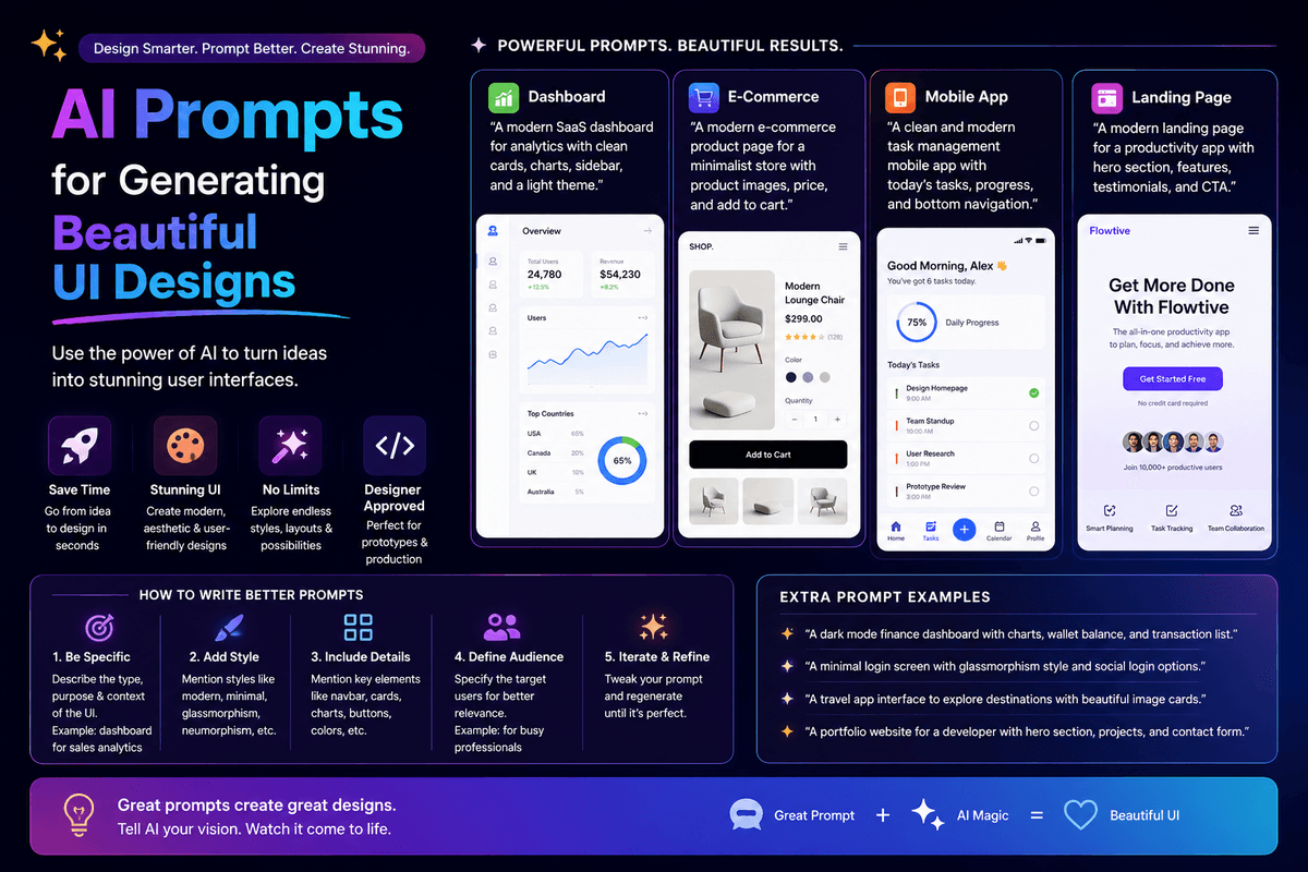
AI Prompts for Generating Beautiful UI Designs
TL;DR
The best AI prompts for generating beautiful UI designs in 2026 are specific about five things: reference brand, color palette, typography, spacing rhythm, and intended emotion. Use layered prompts — start with the overall design system, then refine typography, layout, components, and micro-interactions in separate prompts. This consistently produces UI that feels intentional instead of generic AI-template output.
Introduction
The default UI output from most AI builders is recognizable from a mile away. The same off-the-shelf Tailwind palette, the same rounded corners, the same hero-with-gradient layout. Beautiful UI doesn't happen by accident — it happens because the prompt was specific about the design vibe, the references, and the intentional choices that separate a polished product from a generic template.
This guide covers the AI prompts that consistently generate beautiful UI designs. You'll get copy-ready templates for color systems, typography, layouts, components, and micro-interactions — plus the layering strategy that turns a basic scaffold into something that looks like a designer touched it.
Got an idea? Build it now!
Just start with a simple Prompt
Get Started Today


What makes an AI prompt produce a beautiful UI?
A beautiful UI prompt has five ingredients: a reference brand or style, a defined color palette, typography choices, spacing rhythm, and intended emotion. Drop any one of these and the AI defaults to generic SaaS template output — the kind you can spot from the first scroll.
The difference is stark. A prompt like "make it look modern" produces beige Tailwind output. A prompt that names the reference brand, sets the color palette, picks the typography, and describes the emotional feel produces something close to what a designer would ship. The AI hasn't gotten worse at design over time — most users just don't give it enough to work with.
According to a 2026 Figma design report, AI-generated UI quality varies more by prompt structure than by tool choice, with structured prompts producing output rated 2.5x more polished by designers than ad-hoc prompts. The pattern is consistent across Greta, Lovable, Bolt, v0, and Emergent.
How should you structure prompts for beautiful UI?
Beautiful UI design prompts work like layered design systems — broad strokes first, refinement in passes. The single biggest mistake non-designers make is asking for everything in one prompt. The AI ships generic output when you do this.
Layer your prompts the way designers layer their work
A real designer doesn't pick the button color first. They define the brand vibe, then the color system, then typography, then layout, and finally components. Your prompts should follow the same order.
Use reference brands as shortcuts
Naming a reference brand is the highest-leverage trick in UI prompting. "Make this feel like Linear" gives the AI more design information than three paragraphs of description. The AI has trained on millions of pages of design from major brands, and references let you tap into that context without writing it from scratch.
The best AI prompts for generating beautiful UI — by layer
Below are copy-ready prompt templates that work consistently across modern AI builders. Each one is layered — meaning you run it after a previous prompt has set up the scaffold.
Layer 1: Brand vibe and design system
Start here. Set the overall feel before any specific component.
| Prompt Type | Template |
|---|---|
| Reference brand | "Design the entire app to feel like [reference brand]. Match its visual rhythm, generous spacing, and intentional simplicity. Avoid generic Tailwind defaults." |
| Mood and emotion | "The app should feel [calm and confident / bold and energetic / warm and personal / clinical and precise]. Every design choice should reinforce that mood." |
| Design system base | "Create a small design system with consistent border radius, button heights, and spacing scale. Use 4px or 8px as the spacing base unit." |
Layer 2: Color palette
Color carries more emotional weight than any other design decision. Be specific.
| Prompt Type | Template |
|---|---|
| Define palette | "Use this color palette: primary [hex], background [hex], surface [hex], text primary [hex], text secondary [hex], accent [hex]. Apply consistently across every screen." |
| Reference palette | "Use a color palette inspired by [brand or natural reference — e.g., 'Notion in dark mode' or 'a desaturated forest']. Limit to 5 colors total." |
| Dark mode | "Add a dark mode variant. Use true black sparingly — prefer a deep neutral background with elevated surface colors for cards and modals." |
Layer 3: Typography
Typography is where most AI-generated UI falls flat. Be opinionated.
| Prompt Type | Template |
|---|---|
| Set typography | "Use [Inter / Geist / IBM Plex Sans] for body text and [the same / a contrasting serif] for headings. Set a clear type scale: body 16px, h3 20px, h2 28px, h1 40px." |
| Hierarchy | "Establish strong hierarchy. Headings should feel confident with tight tracking. Body text should be generous with 1.5 line height for readability." |
| Special treatments | "Use uppercase tracked-out text for small labels (eyebrow text, metadata). Use a monospace font for any code, numbers, or technical metadata." |
Layer 4: Layout and spacing
Layout is what makes a UI feel calm or chaotic. Most AI-generated UIs are too dense.
| Prompt Type | Template |
|---|---|
| Generous spacing | "Use generous whitespace throughout. Pad sections at 80–120px vertically. Let content breathe — no walls of text or cramped cards." |
| Layout rhythm | "Use a consistent 12-column grid with 24px gutters on desktop. On mobile, default to single-column with 16px horizontal padding." |
| Visual rhythm | "Alternate section backgrounds subtly between the base background and surface color to create visual rhythm. Keep section padding consistent." |
Layer 5: Components
Once the system is set, refine specific components individually.
| Prompt Type | Template |
|---|---|
| Buttons | "Buttons should have a primary, secondary, and ghost variant. Primary uses accent color with white text. Use subtle drop shadow on hover, not a glow." |
| Cards | "Cards should use the surface color with a 1px border in a slightly darker neutral. Avoid drop shadows; rely on the border for elevation." |
| Forms | "Form inputs should have generous internal padding (12–16px), a visible 1px border, and a clear focus state with the accent color. Labels above, not floating." |
| Modals | "Modals should have rounded corners, subtle overlay (60% black on background), and dismissable on click outside. Keep modal content focused on one action." |
Layer 6: Micro-interactions and polish
This is what separates "AI-generated" from "looks designed." Run these last.
| Prompt Type | Template |
|---|---|
| Hover states | "Add subtle hover states to every interactive element: 100ms transition, slight background shift, no aggressive transforms." |
| Loading states | "Replace any spinners with skeleton loaders that match the shape of the content being loaded." |
| Empty states | "Every empty state should have a friendly illustration or icon, one-line explanation, and a single CTA to create the first item." |
| Transitions | "Add 200ms ease-in-out transitions to all state changes. Avoid bouncy or playful animations unless the brand vibe calls for them." |
Got an idea? Build it now!
Just start with a simple Prompt
Get Started Today
High-leverage prompts for instant polish
Some prompts work in almost every situation and consistently improve UI quality. Memorize these.
- "Make this more opinionated." — Forces the AI to drop generic safe choices and commit to a direction.
- "Reduce visual noise. Remove anything that isn't essential to the task on this screen." — Cuts visual clutter dramatically.
- "Treat this with the design polish of [reference brand]." — Applies the design bar of a brand you admire.
- "Increase whitespace by 30% everywhere. Let the UI breathe." — Fixes the single most common AI design weakness (cramped layouts).
- "Critique this design as a senior product designer would, then fix the top 5 issues." — Surprisingly effective; the AI catches a lot of its own mistakes when asked.
- "Make this feel premium." — Vague but reliable shortcut for nudging toward better typography, spacing, and restraint.
- "Remove every gradient and replace with solid colors." — Kills the gradient overuse that screams "AI template."
Reference brands that produce great UI output
Naming a reference brand in your prompt is the single highest-leverage move you can make. Here are reference brands that consistently produce great UI output, and the vibe each one delivers.
- Linear — Minimal, dark, fast-feeling. Best for productivity tools and developer-focused SaaS.
- Notion — Warm neutrals, friendly typography. Best for content-heavy or note-taking apps.
- Stripe — Confident, sophisticated, financial trust. Best for fintech, payments, B2B SaaS.
- Vercel — Clean technical aesthetic, strong dark mode. Best for developer tools.
- Apple (apple.com) — Premium, generous spacing, strong typography. Best for consumer apps that want to feel high-end.
- Arc Browser — Playful, colorful, modern. Best for creative or consumer-friendly tools.
- Cron / Notion Calendar — Calm, focused, single-purpose. Best for utility apps.
- Superhuman — Fast, tactical, premium B2B feel. Best for productivity power tools.
Combine references for nuance: "Layout like Linear, but with the warmth of Notion" produces something distinct from either reference alone.
How to apply these prompts to a real project
The fastest way to internalize this is to run through the layers on an actual build. Pick a screen — your landing page hero, your main dashboard, or your sign-up flow — and run the six prompt layers in order.
For a complete workflow that includes UI prompts alongside the rest of the build, our Ultimate Prompt Library for AI App Builders shows where these design prompts fit in the broader build sequence. And if you're picking an app type first, our list of profitable AI app ideas covers categories that benefit most from strong UI design (consumer apps, creator tools, premium B2B SaaS).
Common Mistakes to Avoid
- Asking for "modern design" — Means nothing to the AI. Always pair with a specific reference brand or color palette.
- Letting the AI pick colors — The AI's default palettes are generic. Always provide hex codes or a named reference palette.
- Forgetting typography in your prompt — Default fonts make any UI feel templated. Always specify a primary and (if needed) heading font.
- Cramming layout into the scaffold prompt — Layout deserves its own dedicated prompt pass. Don't bury it inside a 10-feature mega-prompt.
- Skipping micro-interactions — Hover states, loading states, and transitions are what make AI-generated UI feel "designed." Always run a polish pass.
- Ignoring mobile prompts — Most AI builders generate desktop-first. Always prompt explicitly for mobile typography, spacing, and tap targets.
- Over-relying on gradients and shadows — Both are overused defaults. Prompt explicitly to reduce or remove them for a more premium feel.
Frequently Asked Questions
1. What's the most important prompt to get right for beautiful UI?
The brand vibe / reference brand prompt in Layer 1. It anchors every subsequent prompt and sets the overall design ceiling. Spend extra time here — five minutes of thought on the reference brand saves an hour of design iteration later.
2. Can AI really generate UI that looks designed, not templated?
Yes, but only when prompts are structured. Generic prompts produce templated output; layered, specific prompts with reference brands consistently produce UI that's hard to distinguish from designer work.
3. Which AI builder produces the best UI from prompts?
It varies less than people think — Greta, Lovable, Bolt, v0, and Emergent all produce strong UI when prompted well. The difference is in editing experience (Lovable's Visual Edits mode), bundled tooling (Greta's growth stack), or stack flexibility (Greta's multi-model support).
4. How do I prompt for a UI that matches my brand?
Include three things: design vibe (minimal, bold, playful, technical), color palette (specific hex codes), and typography preference. The more specific you are about each, the closer the output matches your brand.
5. Should I learn design fundamentals if I'm using AI prompts?
Yes — understanding basics like type scale, color theory, and spacing systems makes you better at prompting and at evaluating output. You don't need to be a designer, but knowing what good looks like helps you describe it.
6. How long does it take to design a full app UI using AI prompts?
A complete, polished app UI can be designed in 1–3 hours using layered prompts on platforms like Greta or Lovable. Polish and micro-interactions typically take another 2–4 hours over a day or two.
7. Will AI prompts replace UI designers entirely?
Not in the near term. AI prompts replace generic, templated design work — junior design tasks, basic SaaS UIs, landing pages. Senior design (brand systems, complex interaction design, accessibility, design strategy) still requires human expertise. We cover the broader question of where AI replaces or augments creative roles in our piece on whether Vibe Coding is the End of Software Engineering Jobs.
Got an idea? Build it now!
Just start with a simple Prompt
Get Started Today
Conclusion
- The best AI prompts for generating beautiful UI designs are layered, specific, and reference-driven — they name the brand, color, typography, spacing, and emotion in deliberate passes.
- Reference brands are the single highest-leverage trick in UI prompting. Naming Linear, Notion, Stripe, or Vercel gives the AI more design context than three paragraphs of description.
- The six-layer prompt structure — brand vibe, color, typography, layout, components, polish — consistently produces UI that looks designed instead of templated.
- Most AI-generated UI fails not because the AI is weak but because the prompts are vague. Specificity beats creativity, and structure beats one-shot mega-prompts.
For the broader build workflow that pairs these UI prompts with everything else, our guide on how to Build a SaaS App in 2026 without writing code covers the full prompt sequence from scaffold to launch. Pick a screen tonight, run the six layers in order, and see what comes out the other side. The bar for beautiful UI is now set by your prompts — use them deliberately.
Ready to be a
10x Marketer?
See it in action


