


How to Build a Waitlist Page That Actually Converts
A waitlist page that converts at 30–50% (top quartile) does five things right: clear positioning ('I want this and here's why'), specific target audience (not 'everyone'), social proof (testimonials, founder credibility, count signal), urgency without manipulation, and a real post-signup flow that keeps signups engaged. Most waitlist pages convert at 5–15% because they're vague, generic, and abandoned post-signup. This guide covers the full playbook — positioning frameworks, page structure, referral mechanics, the email sequence that maintains attention, and the technical build (1–2 days with AI app builders).
Waitlist pages are the most underrated growth tool in indie SaaS. Done well, a waitlist converts 30–50% of visitors into signups, generates ongoing referrals through built-in mechanics, and creates a launch audience that converts dramatically better than cold traffic. Done poorly — which is most waitlist pages — they convert 5–15%, signups churn into inactive emails, and launch day sees few conversions because the audience went cold.
Got an idea? Build it now!
Just start with a simple Prompt
Get Started Today


Why Most Waitlist Pages Fail
- Vague positioning — 'AI-powered something for productive teams' tells nobody what to expect
- Generic target audience — 'For founders and creators' targets nobody specifically
- No social proof — Visitor has no reason to believe anyone else cares
- No urgency — Nothing distinguishes signing up now from signing up later (or never)
- Abandoned post-signup — Email captured, then silence for months
- No referral mechanic — Each signup is one signup; doesn't compound
- Built before validating positioning — Waitlist proves nothing if the framing is wrong
What Top-Quartile Waitlist Pages Do
Element 1: Specific, Evocative Positioning
- Headline names the outcome, not the technology
- Visitor knows in 5 seconds whether this is for them
- Specific enough that the wrong audience leaves (which is good)
- Uses words the target audience actually uses
- Avoids buzzwords (AI-powered, revolutionary, game-changing)
Element 2: Defined Target Audience
- Explicit callout of who this is for (and isn't)
- Example: 'For freelance designers running solo businesses' (not 'for everyone')
- Smaller audience = stronger signal = higher conversion
- Better to convert 40% of a small audience than 5% of everyone
Element 3: Social Proof at the Right Level
- Count signal: '1,847 people on waitlist' or 'Join 2,400 designers' (only when real)
- Founder credibility line: 'By [name], previously [legitimate credential]'
- Testimonial quotes from early users or beta testers (when available)
- Logos of companies waiting (if B2B and impressive)
- Honest framing: Fake or inflated numbers backfire when discovered
Element 4: Genuine Urgency
- Limited beta cohort ('First 100 get lifetime 50% off')
- Launch date proximity ('Launching in 23 days')
- Referral position mechanics ('Skip the line by referring friends')
- Avoid: fake countdown timers that reset, false 'spots remaining' counts
Element 5: Real Post-Signup Flow
- Immediate confirmation email with clear value (not just 'thanks for signing up')
- Weekly or biweekly progress updates leading to launch
- Behind-the-scenes content that builds investment
- Beta access announcements when available
- Survey to refine product direction (and signal engagement)
Page Structure That Converts
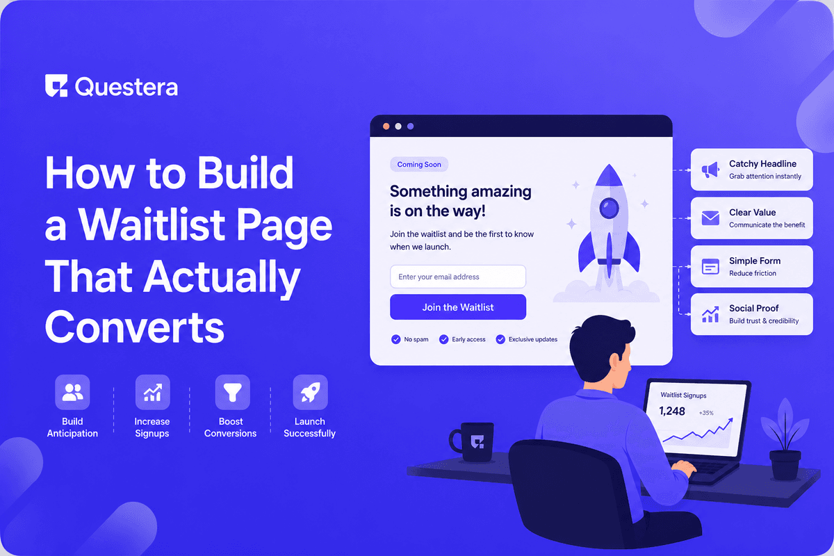
Above the Fold
- Specific, outcome-focused headline
- Subhead clarifying who it's for and what it does in plain language
- Single primary CTA (email field + button)
- Optional: count signal or social proof line
- Optional: short visual (product preview, founder photo, or both)
Mid-Page Sections
- Problem articulation — Show you understand the audience's actual pain
- Solution preview — What the product does (not how it works)
- Differentiation — Why this vs alternatives
- Social proof — Testimonials, logos, or founder credibility
- Specifics — 3-5 concrete features or benefits (not vague claims)
Bottom of Page
- FAQ addressing common objections (when launching, pricing, target use)
- Founder note adding personal credibility
- Repeated CTA
- Footer with contact, privacy policy, social links
Got an idea? Build it now!
Just start with a simple Prompt
Get Started Today
Positioning Frameworks That Work
The 'Category Change' Framework
- Template: 'The [category] for [specific audience] who [specific need]'
- Example: 'The CRM for solo consultants who hate spreadsheets'
- Works when you're creating a niche within an established category
- Strength: immediately clear what you are and aren't
The 'Outcome' Framework
- Template: '[Outcome] without [common alternative pain]'
- Example: 'Ship a SaaS in a weekend without writing code'
- Works for products that solve a specific painful workflow
- Strength: outcome-focused, emotionally engaging
The 'Comparison' Framework
- Template: 'Like [familiar thing] but for [different context]'
- Example: 'Like Notion but for solo product managers'
- Works when you need fast comprehension
- Strength: instant mental model
- Risk: anchors expectations to the comparison
The 'Against' Framework
- Template: '[Bold claim against status quo]'
- Example: 'Email shouldn't be a full-time job'
- Works for products with strong opinion or movement angle
- Strength: memorable, emotionally engaging
- Risk: too clever can be too vague
Referral Mechanics
Robinhood-Style Position Jumping
- After signup, user sees their position in line
- Each referral moves them up a configurable number of positions
- Top N positions get early access or premium perks
- Famously took Robinhood from 0 to 1M signups before launch
- Works best for products with clear scarcity (limited beta seats, early-access pricing)
Simpler Referral Ask
- Post-signup page: 'Help us launch — share with friends'
- Pre-written tweet, LinkedIn post, email template
- Less aggressive than position jumping
- Lower conversion lift but easier to implement
- Works for niche audiences that share organically
Rewards-Based Referral
- 'Refer 3 friends to get lifetime free' or similar
- Clear, finite, valuable reward
- Most viral mechanism when the reward genuinely matters
- Risk: race-to-the-bottom dynamics if rewards are too generous
Tooling for Referral Mechanics
- GetWaitlist.com — Drop-in waitlist with referral mechanics; free + paid tiers
- Waitlist.email — Similar service; integration-friendly
- Custom build with AI app builder — Position tracking + unique referral URLs (1–2 days)
Got an idea? Build it now!
Just start with a simple Prompt
Get Started Today
The Post-Signup Email Sequence
Day 0: Immediate Confirmation
- Confirm they're on the list with position number
- Set expectations: when you'll hear from us, what to expect
- Single CTA: refer friends to move up
- Founder voice, not corporate template
Day 3–7: Why I'm Building This
- Founder story — Why this product, why now
- Background and credibility
- What you're trying to fix in the world
- Builds investment in your specific journey
Day 14: Behind-the-Scenes Update
- Screenshot or video of what you're building
- Early decisions you're making
- Specific problem you're solving this week
- Single CTA: reply with what feature matters most to you
Day 30: Audience-Specific Content
- Educational content related to your audience's main problem
- Not necessarily about your product
- Builds your authority in the space
- Reinforces 'I'm the right person to build this for you'
Day 45–60: Beta Access Announcement
- Open beta to top referrers first
- Then to next tier
- Clear timeline for full launch
- Specific feedback ask from beta users
Technical Build (1–2 Days)
Stack
- Next.js for the landing page
- Supabase for storing signups (email, referral_code, referred_by, position, created_at)
- Resend for transactional emails
- ConvertKit or Loops for the multi-email sequence
- Vercel for hosting
Build Sequence
- Hour 1–2: Landing page in AI app builder with positioning and conversion elements
- Hour 3–4: Signup form wired to Supabase with email validation
- Hour 5–6: Confirmation email sent via Resend
- Hour 7–8: Referral mechanic — unique URLs, position tracking
- Day 2: Email sequence in ConvertKit, behind-the-scenes content prep, testing
Measuring Waitlist Performance
| Metric | Healthy | Concerning |
|---|---|---|
| Visitor-to-signup conversion | 20–40% | Below 15% |
| Referral rate (signups from referrals) | 15–30% | Below 5% |
| Email open rate | 40–60% | Below 25% |
| Email reply rate | 1–3% | Below 0.5% |
| Beta-to-paid conversion at launch | 10–30% | Below 5% |
| Unsubscribe rate per email | <1% | Above 3% |
Got an idea? Build it now!
Just start with a simple Prompt
Get Started Today
Common Mistakes
- Building waitlist before nailing positioning — Conversion will stay low until positioning is right. Test before investing in polish.
- Targeting 'everyone' — Specific audience converts higher. 'For solo lawyers' beats 'For professionals.'
- No post-signup flow — Email captured then silence kills launch-day conversion.
- Inflated social proof — Fake numbers backfire. Real numbers, however small, beat fake big ones.
- Manipulative urgency — Fake countdowns and false scarcity damage trust. Don't.
- Multiple competing CTAs — One primary CTA. Secondary actions distract from conversion.
- Generic confirmation email — 'Thanks for signing up' is a wasted opportunity. Use it to set expectations.
- Ignoring referral mechanics — Compound growth from referrals matters most for waitlists. Build them in.
- Treating waitlist as static asset — It's an audience to nurture, not a list to collect.
- Launching without notifying waitlist properly — The waitlist IS your launch audience. Activate them deliberately.
- Too-clever positioning — Clarity beats cleverness.
- Skipping FAQ — Common objections prevent conversion. Address them.
Frequently Asked Questions
How early should I launch a waitlist?
When you can articulate the positioning clearly and have something tangible to share (early product previews, design mockups, founder story). Too early (no concrete value to share) produces low-quality signups. Too late (product already launched) misses the leverage.
What if I'm not sure about positioning yet?
Test positioning before investing in a polished waitlist. Run paid traffic (small budget) to test variations of headline and target audience. Iterate until conversion exceeds 20%; then invest in the broader waitlist build.
Should I require email verification?
Yes. Verified emails are real signups; unverified emails are vanity counts. Use Supabase Auth or similar for built-in verification.
What if my waitlist conversion is stuck at 10%?
Almost always positioning. Test the headline and target audience callout. Get specific feedback from people who didn't sign up (ask them why).
What about offering pricing on the waitlist?
Yes for specific tiers (lifetime deals, founder pricing). Sets clear expectation and pre-qualifies serious signups. But avoid full pricing menus on waitlist — those are for the actual launch.
Waitlist pages that convert at 30–50% do five things right: specific positioning, defined target audience, social proof, genuine urgency, real post-signup flow. Referral mechanics compound growth. The post-signup email sequence is non-optional. If you have a waitlist converting below 20%, the problem is almost certainly positioning. If you have a waitlist collecting emails but going silent, the problem is the post-signup flow. Build deliberately; nurture relentlessly; launch with a warm audience already invested in your success.
Got an idea? Build it now!
Just start with a simple Prompt
Get Started Today
Ready to be a
10x Marketer?
See it in action


